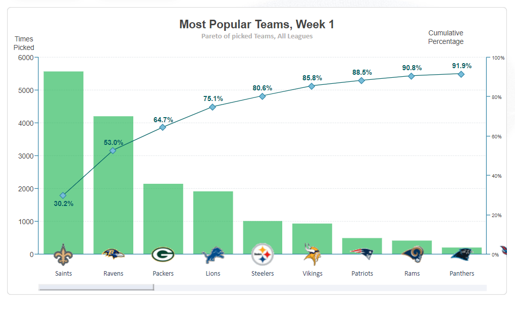
A Pareto chart is a type of chart that contains both bars and a line graph, where individual values are represented in descending order by bars, and the cumulative total is represented by the line.
We hope you find this useful in your survivor pool endeavours!The Survivor Pool Pareto Chart
By Fred Williams • July 10, 2019

Due to popular demand, we've added a Survivor Pool Pareto Chart to help players when deciding on which team to pick. Consider the example above from week 1 in 2018. What the pareto chart above shows is that 5500 players across the site chose the Saints, which was 30.2% of all players. The Ravens were picked by roughly 4200 players. The 53% shown on the Ravens column represents the % of players who chose the Saints and Ravens combined. The 64.7% o the Packers column is the % of players who chose the Saints, Ravens, and Packers, and so on.
To be precise, here is the definition from Wikipedia:
← Back to BlogRelated Articles
🔥 Most Popular This Week


